FixFast - Ecommerce redesign
Brief
Design and develop a best-in-class web experience that promotes Fixfast as an industry-leading supplier of fixings, cladding and sheeting. Beyond this, the brand experience will position Fixfast as a reputable supplier to prospective new businesses and existing customers.
Client
FixFast
May 2022 to March 2023
Challenge
Design and develop a best-in-class web experience that promotes Fixfast as an industry-leading supplier of fixings, cladding and sheeting. Beyond this, the brand experience will position Fixfast as a reputable supplier to prospective new businesses and existing customers.
How do we create a homepage experience that ensures a consistent look and feel?
Project Approach Documentation
Stakeholder Interviews
To understand the project's stakes, I conducted stakeholder interviews with the Client and key people with their business to get context and identify business goals and success. I questioned them about insights, employee and customer habits, expectations, and goals for this project.
“[the website should be for customers and staff] I’d like to see people (staff) using the website using the website rather than going to the server.”
“Showing the website now, it doesn't portray that we are the leading in our industry, as soon as you land on the landing page it doesn't tell what we do, not a lot of text.”
"New customers don't look at the website and think wow, not enough photos of what we’re doing with the fixings.”
UX Audit
I led the UX Audit with an evaluation of key areas in the e-commerce site and logged-in account area, I conducted a heuristic analysis identifying best practices, user pain points and opportunities
Recommendations with quick wins
With the findings from the stakeholder interviews and the UX audit, I collated quick wins that could be worked on parallel to the redesign project workstream. The quick wins helped to gain buy-in from key stakeholders as it demonstrated tangible improvements that can be rolled out to the redesign project.
competitor landscape
I carried out a competitor analysis of competitor and compratar companies looking at the Experience, Information Architecture and Visual Identity
Experience
There is a similar experience online with the B2B brands, competitor brands stand out because of the design aesthetics and product features
Visual Identity
Consistency of design language with some competitors influences how the quality of their product is perceived
Personas
It was identified that there were three key personas, the facade customer, main contractor and the architect.
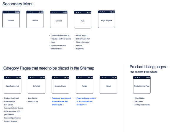
Sitemap
I created the documentation of the sitemap. A secondary menu was important to include and categorise the pages within this section, with the secondary menu it was incorporated to help users find ‘less important’ information on the site.
MOVING INTO DESIGN
key considerations
How do we create an online experience that showcases FixFast as an industry-leading supplier to new and existing customers?
How do we create a homepage experience that ensures a consistent look and feel?
Product Design Principles
EFFICIENT
We want to help people achieve their goals quickly and accurately, whether browsing, shopping or ordering.
Trustworthy/Reputable
Our accreditations, case studies and client testimonials demonstrate our genuinity and reliability.
Confidence
We want users to feel they can accomplish whatever they are trying to discover or order, no matter their level of experience with our site.
Simple
Ordering with FixFast is simple and easy, for small contractor services through to medium and larger size businesses.
UX Visual Research References
What was noticed from Indirect Examples, was the breakdown of the product, which showcased and explained the quality of the product at a glance and in detail. This is a gap that Fixfast was missing. Additionally they provided contextual imagery of the product in situ as well as clean and simple page design.
With the CTA and text links I noticed with these brands and how they listed the products, there is encouragement for the user to understand the item further rather than a hard sell. With Apple the ‘Buy’ textlink has a similar weighting to the ‘Learn more’ and this is similar with the brand Bugaboo.
With the structure of the site, we decided to introduce a secondary menu that allowed the user to see at a glance key actions or relavant content but not be distracted from the products they were looking for. Here are examples of how these brands included a secondary menu, search bar as well as placing key content such as ‘Help’ or ‘Customer Services’.
Information Architecture + Wireframes
With the page structure, I focused on the key considerations, to show industry-leading supplier to new and existing customers, therefore choose to include strong imagery of the product in use and statistics that boost confidence and show the scale on which they operate. Prominence was given to a key piece of content that arises from customer services enquires which is the Skills Hub - a resource to help users self-serve with their queries regarding the product, the application, installation and technical. details they may require.
Customer reviews and case studies were added to the Homepage, FixFast has worked on numerous commercial projects that weren’t apparent from looking at their site. This helps to increase social proofing and shows them as a leader in this industry.
Colour Palette
Blue was introduced into the colour palette as it was predominately black, grey and white. Blu has a universal appeal and is associated with trust and stability making users feel secure.
imagery
A new style of imagery was chosen that showed the quality and texture of the product up close and at a distance, we also include examples of the product in situ, so prospective customer can begin to see if its suitable to the location or type of building the were constructing.


